 Anyone that’s been reading this blog for long enough will remember my episodic ravings about 2006’s ‘Kemonozume’. Despite its bold originality and refreshing lack of convention, it was never a series that went down well with the majority of fans. Fact was, because it looked different, because it wasn’t pretty, it was ignored. Big surprise, anime fans like their anime to look like anime, and any serious deviation from this stock style is greeted with depressing indifference.
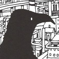
Two years on and another spring season fast approaches; while most will be predictably celebrating another onslaught of ‘Code Geass’, I want to point out that Kemonozume’s creative maestro Masaaki Yuasa has something new airing too; it’s called ‘Kaiba’ and, as expected, it’s looking thoroughly weird.
Iwa ni Hana describes Kaiba’s visual style as “gauntlets thrown into the face of the anime industry”. Of course, Yuasa and Madhouse could quite easily have pandered to the majority audience and designed their characters as if they’ve fallen off the generic moe\bishojo production line, but they don’t. Thankfully, their commitment to artistic intent takes precedence over cynical, easy money. It’s a reassuring feeling because, quite frankly, I wouldn’t be an anime fan if everything looked like ‘Clannad’.
 First and foremost, anime is a visual medium; the way something looks, and more to the point, how that makes me feel is absolutely key to my enjoyment. Because I’ve never enjoyed the generic anime aesthetic, sitting down with, for example, a series as well liked as ‘True Tears’ is a real struggle for me. It sounds superficial, but before I’ve even seen an episode, I really need to feel like I’m going to be experiencing something fresh, new and exciting. That’s why I’m so attracted to anime like ‘One Piece’, ‘Gurren Lagann’ and ‘Dennou Coil’, series overflowing with a strong sense of design. To this day, I still remember the moment I decided to take a chance on ‘Honey & Clover’; it was after seeing this image on the now dead anime blog Cinnamon Ass – everything I needed to know, all that wistful, mature, romantic nostalgia, is encapsulated in that one frame.
For all our whispers of heart-felt beauty, the key factor, on a base personal level, is empathy; just looking at them, are you willing to care about certain characters? Some people are open minded enough to sit through everything, while others prefer to revel in their familiar aesthetics. Me? I get annoyed at the anime fans that can’t enjoy ‘Escaflowne’ because of Hitomi‘s big nose, but at the same time, I’m afflicted by an abhorrence to the moe/bishojo style. As much as I want to condemn people for ignoring ‘Tekkonkinkreet’ just because it looks ‘odd’, I’m finding myself in a similar situation with, to pull a name out of a very big hat, ‘Ef ~ a tale of memories’. For me, the aesthetic ruins the substance, does that mean, then, that the aesthetic is the substance? Are we really that superficial?
The aesthetic clause
17 responses to “The aesthetic clause”
-
I love the character designs in the first image. It looks like they are paying tribute to things like Astro Boy. Anyways I think its adorable. But what is it supposed to be about?
And I am also not a big fan of the bishoujo style either. If I like the story I’ll deal with the style but in most cases I don’t seem to like the story either.
As for Escaflowne, I am not really a big fan of its character designs (the mecha looks awesome though) but that doesn’t stop it from being one of my favorite series. -
Hmm. For theoretical reasons, which might not stand up and which I won’t reproduce here for reasons of brevity (they probably boil down to me going on, and on, about the sonnet), I’d say the aesthetic is certainly part of the substance – though not all of it. It’s not so much that we’re superficial, but rather that the ‘look’ of a series is less superficial than it might at first appear. So we can be bothered by that ‘look’ without condemning ourselves as shallow swine unable to appreciate the pearls strewn before us.
But of course my curmudgeonly beef with ef was not the ‘look’ but my distrust of anything which invites you to analyse it. I do not wish to be cast as the fly walking into the animator/spider’s parlour. -
Anime is a visual medium but the core of the anime is not the pictures: it is what stories they tell. Everything is judged by how they linger in people mind and the most poignant ones involve good story development up to that point or scene as well as well thought out dialog prior to the scene. Kemonozume may have newest ideas in visuals but for me, what made keep away was that there were too much violence. Any series with emphasis on violence may have tendency to keep away large portion of the viewers for various reasons, thus even though I will accept your claim for the series’s originalities, I do not plan to pick it up in near future.
-
It’s great that you can appreciate anime that looks a little “different.” It seems people are way too caught up in the way something looks that they can’t even begin to pay attention to everything else that makes a series great, let alone actually give the thing a chance. Although I guess, as you’ve admitted, you’re somewhat of an opposite of most people’s preferences.
I’m definitely one to praise a good art style or good animation whenever it’s present, but in the end, art and animation is usually one of the last things on my mind. If it looks “weird,” if it’s old, if it’s common, it tends not to make a difference in my eyes. I used to be a big proponent of “cel animation over newer digicel animation” but I’ve even gotten over that. I notice that I rarely bring up animation on my blog as well. It’s just not something I really care much about, as long as whatever I’m watching is good.
One thing about style, however, is that it can be indicative of things. A unique art style can be indicative of a production team taking a risk and trying something new. Cutting away from all that is standard. Is this always a good thing? No, originality is not always the best, but often times it means good things. At the same time, a generic art style can be indicative of a production team that just wants to make a quick buck off conventions that have already been held tried and true (hence, the “moe/bishoujo” phenomenon). Is that always a bad thing? No, very good works can be found that have some of the most commonplace designs ever, but often times you won’t find much of anything that’s new and refreshing here.
So to me, art style is largely irrelevant. But it can be relevant. 90% of all anime are going to have designs that look very familiar, but that doesn’t mean that 100% of those 90% aren’t worth watching, or that they have no substance. So I guess my point is that, overall, it’s all very relative. -
I’ve had this problem too where aesthetic has ruined the substance a lot for me – mostly because anime is a visual medium, not a textual or aural one so aesthetics DO say a lot about the creators’ content, and what they intend to convey to you. And while it isn’t everything, it does bleed into a part of the story. (Direction in particular) It’s a bit of a tricky and sometimes hypocritical thing… For example, I liked Kemonozume but I won’t call it my favourite simply because it isn’t my most favourite sorta artform/storyline (I preferred something like Tekkon Kinkreet, go shoot me). However, I can recognize the fact that they’re trying something nearly unheard of in entire TV series and the very interesting, honest intentions of the staff behind the show…. Yet I feel rather miffed in a way when people praise the show based MAINLY on this. I dunno, it just smacks of art-school disregard for the average anime (to put it crudely) and while I readily slam moe cookie-cutter things most of the time myself, and know that 90% of anime won’t hold up to good standards, I feel so hypocritical about this.
Even I find myself increasingly judging on whether I want to watch an anime or not based on the aesthetic and assuming too much – and I find myself losing that very excitement that brought me to watch anime in the first place. The problem is, if I just forget about this and try other anime that I didn’t intend to follow (like Baccano!) I can enjoy them very much anyway. I really need to stop being so damn serious about what sort of anime I want to watch, or I shall turn into yet another bitter old lady with a righteous sense of taste or something. Get off my sakuga lawn! -
I do also think that the “generic” character designs of anime act as a hook that separates it from other forms of animation or other media. Far too often I’ve heard that people decide not to watch something because “it looks too weird/old/etc”, and I do wonder if that indicates something. It does seem like works that tend to have atypical character designs also tend to be a more involved watch. So for someone who just wants to get entertainment out of the whole thing, it’s a “stick with what you know” sort of thing.
At the same time, I’ve also heard plenty of people decide not to watch something because of the the generic character designs themselves (such as the “moe-blobs”). Do those people correlate designs to how they the show itself is going to be?
I mean, you don’t see (Gegege/Hakaba) Kitaro as the lead of a harem show, do you? 😛 -
I understand what you’re saying here I really do. Sometimes though you have to go after the conventional stuff to get to the meaty parts of its plot and believe me, you’ll be greatly rewarded. Sola and EF although they scream bishoujo/ero/game-adaptation, they still tell a good story…if you’re willing to stick around that is. I completely agree that people need to try new stuff and come on! The big noses in escaflowne were a trademark not a trade-off! Hehe I’m a victim of this so called superficial judgment as I stay away..far far away (secretly knowing that I’d probably love it if I take my time watching it) from Kaiji because of the drastic designs. Maybe if I wasn’t watching too many shows and wasn’t overloaded already I’d give it a chance. I believe a true anime fan should try everything, its such a varied medium, giving everything a chance instead of slapping the dreaded “ugly designs” on it before it even starts. Judging from my experiences, aren’t we all this way though?
-
there are certain kind of character designs which I find off-putting (I can’t really explain it myself, but those I consider to be not so aesthetically pleasing to the eyes), but once I find out that its story is my cup of tea, I’d readily lower down my aesthetics elitist self, which I found myself doing for One Piece xD
-
I’m amazed that Ivy’s the first person to mention Kaiji. I’m also amazed that I forgot to mention Kaiji.
-
So I hear Kaiji does similar confrontational things with its visual style?
<3
But yes, I’m pretty damn excited by Kaiba after seeing Iwa ni Hana’s postings. The character designs remind me slightly of Hajime Ueda, FLCL and Q-Ko-Chan’s mangaka, only with a rounder, less jaggy style. I don’t think he’s involved with this, though. I would pretty much wee myself a little if Masaaki Yuasa and Hajime Ueda ever worked together. *writes that down as an anime dream-team*
Thanks for introducing me to Iwa ni Hana, by the way. It’s right up my street! -
I suppose we’re all guilty of preconceptions and prejudices – I wouldn’t go as far as saying it’s hypocritical because enjoyment of a visual piece is affected by a mixture of factors including art style, story, characters and music so liking or disliking something may not be as irrational or elitist as others might think. Sometimes, a show is outstanding in one respect which can compensate for deficiencies in another; similarly one jarring detail can put a viewer off entirely.
As for the examples above, I’d say Clannad is pretty solid art-wise but the generic nature of the characters and story mean that it’ll never be a favourite of mine. As much as I admired Kemonozume, its innovative style almost challenged the viewer to like it. In a similar way, Sonic Youth and Melt-Banana have garnered very niche followings because their music is very atonal; quite unlike chart-friendly fare that’s more melodic, but very generic and predictable at the same time.
I think dismissing something because it’s different should be avoided just as much as doing the same to a show because it’s popular. I probably am swayed towards something that looks pretty in the same way that, no matter how heavy, experimental or unusual a piece of music is, I want to find some semblance of melody. Comfort zones have a lot to do with this I think but if there’s one thing I’ve learned from being an anime fan, acquiring the most eclectic taste you can is the most rewarding! -
Epic comment replies below. More coming once I’ve had the opportunity to rest my poor typing fingers!
@Kim: I think, once I’ve overcome the first hurdle of actually seeing an episode or two, if I like a series, I’ll never think to question the art or whether or not I like how certain characters look or act. It’s kind of like a switch in my brain that allows me to flow with a story, so I’ll never really think about how something might be ‘better’ if it looked differently. That goes for character designs too, so it’s not really a case of lamenting the noses in Escaflowne, that’s simply how they look and I’d never want to change that. Even writing this now, I’m confusing myself, so apologies if that seemed a tad on the rambling side 🙂 Also, there’s a well translated plot synopsis for Kaiba at the aforementioned Iwa ni Hana, but in short, it’s all about Kaiba retrieving his lost memories.
@IKnight: You’re right, after all, this is animation rather than live-action film. At its basest level, creating anime involves an artist tasked with conjuring an image from imagination alone. That’s a really profound concept we often over-look in our pursuit of ‘depth’; the image itself, the imagination that unfolds before us, is the true revelation of animation. After catching an episode on TV last night, I’d have to say Cowboy Bebop is one of the best examples of this understated beauty.
@maglor: The stories though, they illicit emotion from you because you see something in the image. When I think of some of my favourite scenes in anime, what lingers most isn’t the dialogue or the music, it’s an image; a picture of emotion that captures my imagination. For me, then, good story development and good art direction go hand in hand. Also, I don’t blame you for not digging Kemonozume; it’s a series loaded with an excess of sex and violence, but at least you’re not refusing it just because looks different.
@KT: I take your point (very well stated it is too), but at the same time, if an art style is irrelevant, are you willing to sit and watch ‘sola’, or Clannad, or Kanon? As for myself, if those aforementioned series looked like, for example, One Piece, I’d be 100 times more likely to give them a shot, and furthermore, I’ll bet all those people blogging about it right now probably wouldn’t be bothering. This leads to my assumption that for all our talk about ‘moving’ and ’emotional’ characterisation, most of it is just based on how we perceive the character design and ultimately, whether or not we’re capable of empathizing with said character.
@w: My inspiration for this post was Tekkon Kinkreet. It’s the kind of movie that every time I catch even an AMV, I feel like I have to recommend it. It frustrates me to no end that it’s being largely ignored by the “mainstream” anime viewers, but at the same time, I’d feel like a hypocrite if I were to criticize others for ignoring it just because it looks a little strange when I’m guilty of avoiding certain other anime for similar reasons. So basically, I understand your conflict of feelings, which is what I was trying to express with this post anyway. Sometimes we’re so caught up in our lofty preconceptions that we miss out on anime that we could enjoy (for me, I nearly missed out on Ghost Hound because I didn’t like the art style at first), but even still, without applying any bias, could you watch something as genuinely generic as Clannad, sola or School Days? I could never bring myself to do it, no matter how much I’m told they are good.
@TheBigN: I must admit, I’m guilty of using character designs, especially the “moe-blobs”, as a guide to the anime itself. My rule? Avoid anything with aforementioned “moe-blobs”! The day I stop doing it will be the day my rule is broken by an awesome anime that contains that specific aesthetic, but so far, and despite what the fan boys have said, that hasn’t happened. And yes, you know I’d so watch harem anime if it had art like Hakaba Kitaro 🙂 -
@Ivy: Yeah, I guess we’re all guilty of being a little superficial at times. I’m sure you’ll be surprised to learn I actually tried to watch sola last year… I didn’t like it. It wasn’t especially bad or anything, I just found it to be a rather ‘clinical’ harem anime. And again, I’ll point to my lack of interest in the typical bishojo style of character designs. Oh well, I really sat down with sola to try to broaden my viewing of anime.
@usagijen: I’d say One Piece has some of the best character designs in anime, but it’s zany style probably contributes to that. I’m not sure if you’ve seen it yet, but the Thriller Bark arc has some insane art going on. And amongst many other things, that’s why I watch anime like One Piece; to see something new, colourful and fun!
@Hige: Like Kim said, I’m getting big Astro Boy/Osamu Tezuka vibes from Kaiba. Really though, I’ve no idea how it’s going to turn out, and I guess that’s a testament to Yuasa’s mad-cap style. What I do know is, I’m hoping to try hard and blog it. Also, glad I’ve sent you over to Iwa ni Hana. Like the anime they cover, their blog is on the fringes of the “mainstream” anime blogging community, but the constant coverage of “art house anime” is priceless and fascinating. Makes a massive difference to find another blogger covering the kind of anime that’s often so underrated. If Wabi Sabi is reading this, keep up the good work 🙂
@Martin: The comfort zone point is interesting because I suppose it’s fairly fundamental as to whether or not you’re even willing to go out and watch something that, in all probability, you probably won’t like. My own comfort zone is simply that I hate watching anything that appears to be generic, so I’m attracted to odd looking anime because it’s almost an assurance that what I’m seeing will be exciting, new and original, like I’m afraid of wasting my time. Saying that, I think my feelings on all of this are a little more complex than can be summed up in a single paragraph, but these comment replies have gone on long enough as is 🙂 -
I would be willing to watch those shows, actually. I’ve been recommended “ef – a tale of memories” by Martin (whose taste I trust), which I’m willing to give a try; sola I’ve heard mixed reviews for, but I would be willing to give it a try to form my own opinion; and I’ve already dabbled in a couple episodes of Clannad when it first premiered. As for Clannad, I felt the show was very mundane, contrived and borderline boring (at least for the two episodes I watched). It had the same conventions of every other series in its genre (and it’s generally a genre I dislike for that), it just happened to be animated well. But none of my opinion had to do with the character designs.
So to me, as I said, if aesthetic has anything do with me and a show, then it’s just in what it can be indicative of. But as I realize this is not an entirely accurate way to prejudge a show, I’m willing give [most] shows a chance, depending on how strong that indication is to me. If I’m seeing tons of cutesy little girls in maid outfits or skimpy bikini things or whatever, then yeah, I most likely won’t even touch that (because to me, that’s indicative of a show that’s probably going to pander to the weird “loli” crowd, have little-to-no plot, have a bunch of really annoying cookie-cutter, trying-way-too-hard-to-be-cute characters, etc., none of which is of my tastes). By this example, I’m sure you could tell that I tend to relate this sort of thing to my perceived idea of what the actual content of the show might be, and not just what it looks like. If every show that had moeblob character designs had amazing stories that blew me away, then I wouldn’t give a damn about the moeblobs, and wouldn’t mark them down just because they had generic character designs. But unfortunately that’s not the case, and 98% of the shows that I have actually watched from the genre I found little to like in. So now when I see strongly similar designs, an alert goes off in my head that tells me I should probably stay far away. But even still, in some cases, when I’m feeling funky, I might try one once in a blue moon, just to see if my opinion had changed. It’s just the way I am.
So yeah…art style and animation…it plays almost no factor in how much I can enjoy a show. I just don’t pay that much attention to it. I love and appreciate great animation and design, I don’t mind average animation and design, and bad animation and design would have to be REALLY bad in order to distract me from enjoying the story. Just the way it goes with me. -
Style is substance, but that’s not a problem of being superficial, bur rather of understanding an object of art as a whole rather than an entity sprung out of 2 different concepts: looks vs. meaning. I’m not a big fan of this idea that style is a mere carcass for a “deep” “something” inside (much too dualistic and reminiscent of ambiguous religious definitions).
Therefore, I believe substance is embedded in style and viceversa and couldn’t be possible otherwise. honey and clover would never be the same if drawn in a complete different style , not to mention One Piece (which style I don’t think you “ignore” bur rather enjoy – if I remember correctly one of your earlier posts – so it’s not a question of looking beyond the “ugly” drawings to find a beautiful significance, but rather of adapting your artistic perception to a new, different kind of aesthetics and thus being able to enjoy it without prejudice).
Also, I don’t think anime is very much about the highly interesting themes and stories. Just read some short synopsis of various anime that we all love and check how ridiculous and corny it all sounds. It’s pretty much the same themes over and over again: friendship, love, sadness, loneliness, etc. the universal human stories that are narrated over and over again, through different time periods, in different ways, that’s why, as I said earlier, it’s the style in which that particular story is presented that does a whole lot of difference. Once again I take Honey And Clover as an example: a story about a bunch of art students, typical becoming-of-age story, plus a couple of love triangles. But HOney and Clover is actually a masterpiece of wonderful details, of human understanding, of perfect visual style, atmospheric music etc. it’s the whole… -
@KT: Thanks for elaborating. Suffice to say, you’re a lot more open minded than me when it comes to this kind of thing; that you’ve even survived a few episodes of Clannad is impressive! I’d have given up with the opening theme!
@Ubiquitous urchin: I think you’ve nailed it, with that second paragraph in particular ringing true. I never sit down to anime feeling like I have to consciously see through some “ugly” art in order to empathize with the story, rather, it is, as you so aptly put it, “adapting your artistic perception”. That’s what I was trying to convey in my reply to Kim’s comment on Escaflowne without ever really finding the right words. So, thanks for your perceptive insight into this. Finally, glad to see you’re also a big fan of ‘Honey & Clover’; since falling for its charms, H&C has been in my top 3 anime of all time. It’s a masterpiece and indeed, I just wish it was airing right now, because I’d love to talk about it at length. -
Showing some love to this topic “new to this wordpress”. I defiantly agree with it also. If you really think about it than it all makes alot of sense
Leave a Reply